A blog about various VFX related things

Stylized Motion Blur

Whilst motion blur and correct motion blur in particular is something we all should strive towards as VFX artists, I’m going to dedicate this article to a technique I came up with on a recent project. If you read through it all I’ll show which project at the end. No scrolling/cheating!

I’m tempted to say it’s an original idea of mine, of which I don’t have many, but I wouldn’t be surprised if I picked it up from someone else. Either way, I thought I would share the idea here and if someone sees it and recognizes it from elsewhere, feel free to message me so I can acknowledge the source!

The basics

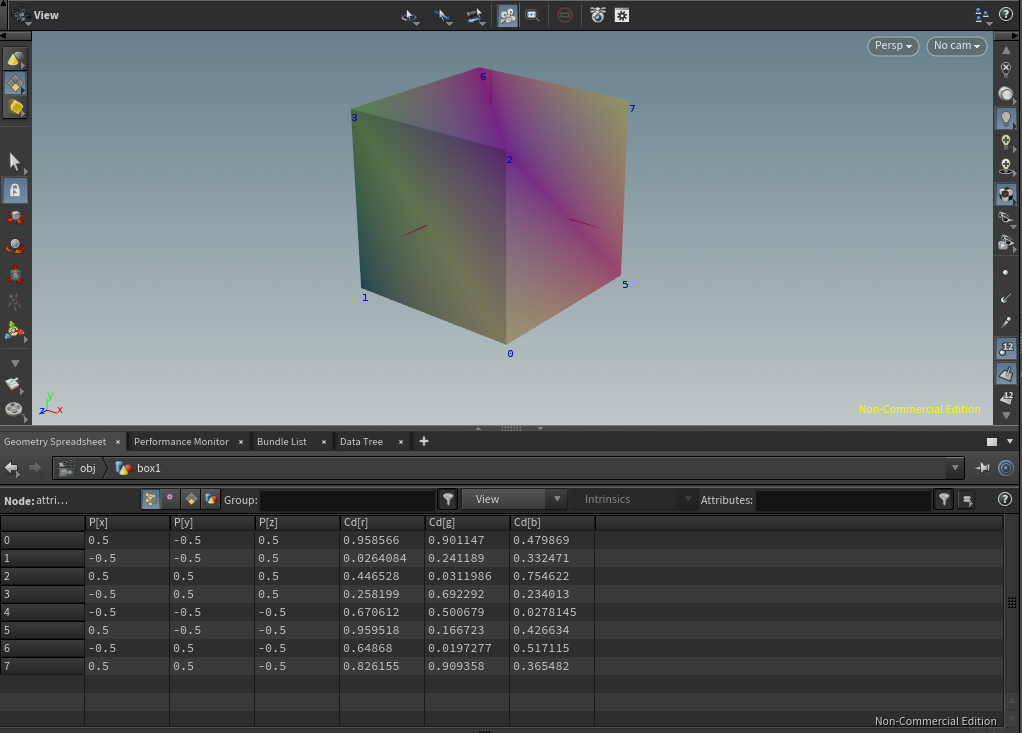
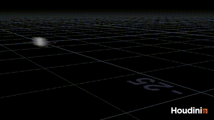
Consider this box (or square in the ortho view we’re seeing) peacefully traveling at a linear speed minding its own business. If you were to render that with motion blur it would do so without any issues, silky smooth.

The “gold standard” of 3D motion blur is when we are able to interpolate what’s happening with our geometry (and cameras) from one frame to another, allowing us to sample what happens inbetween the frames; the sub frames. In the case of a our box, it’s not all that interesting, as the motion is completely linear, but let’s see where we can take it. Let’s say for one reason or another we wanted to exaggerate the motion blur of our box; make it longer. We could tweak the shutter speed of our camera, but we’re interesting in getting familiar with  sub frames in this article, so let’s leave the shutter speed as it is and see if we can make Houdini interpolate our animation in a different way, resulting in a different motion blur.

So if we consider rendering frame 1 with interpolated motion blur, the default behavior in a render engine like Arnold  is most typically that whatever happens between frame 0.5 and 1.5 will contribute to the motion blurred frame. This is often referred to as “Centered” or “Central On Frame” motion blur. Mantra (Houdini) defaults to what it calls "after" or “Forward”, which is the equivalent to “Start on Frame” in Arnold

Either way, in all my examples in this article I’ll be forcing everything to look before, backwards or “End On Frame”. This is crucial, as you would get very different results if you miss that setting!

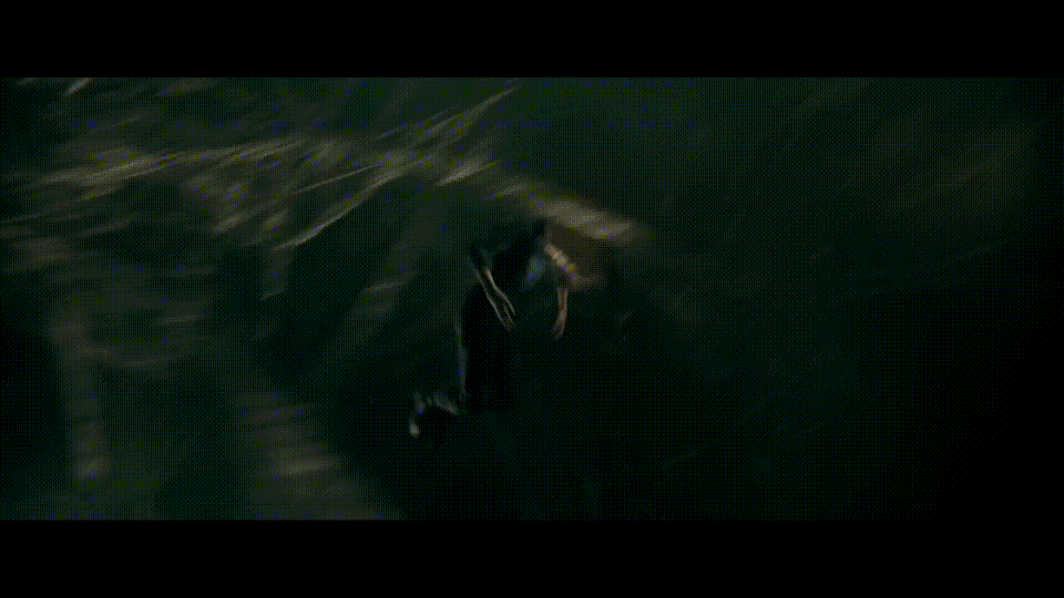
So above we have the same box, but this time we’re looking backwards much further than what the default interpolation would have done, and as a result we get this exaggerated blur effect.

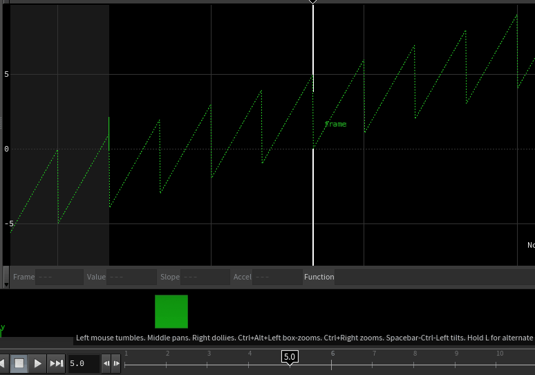
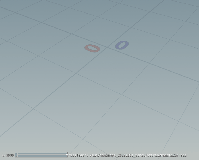
The above gif shows what’s happening on the sub frames; the peaks in the graph editor are the “whole frames”, and the valleys are the sub frames. To really hammer it home I’ve coloured the box green on whole frames, and red on sub frames. And the reason I’m really trying to make this part as clear as possible, is that with this ability to influence what happens on sub frames we can create some pretty nice effects, so it’s important that we are on board with how it all works.

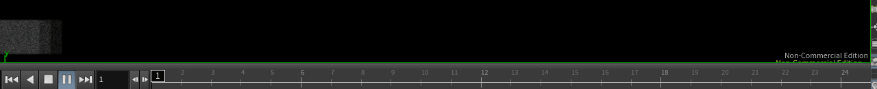
Before I forget; In case you did not know, we can enable sub-frame scrubbing in the bottom left corner of the time line. You will toggle that on and off a lot when working with sub-frames, and for debugging motion blur in general!

How to set it up

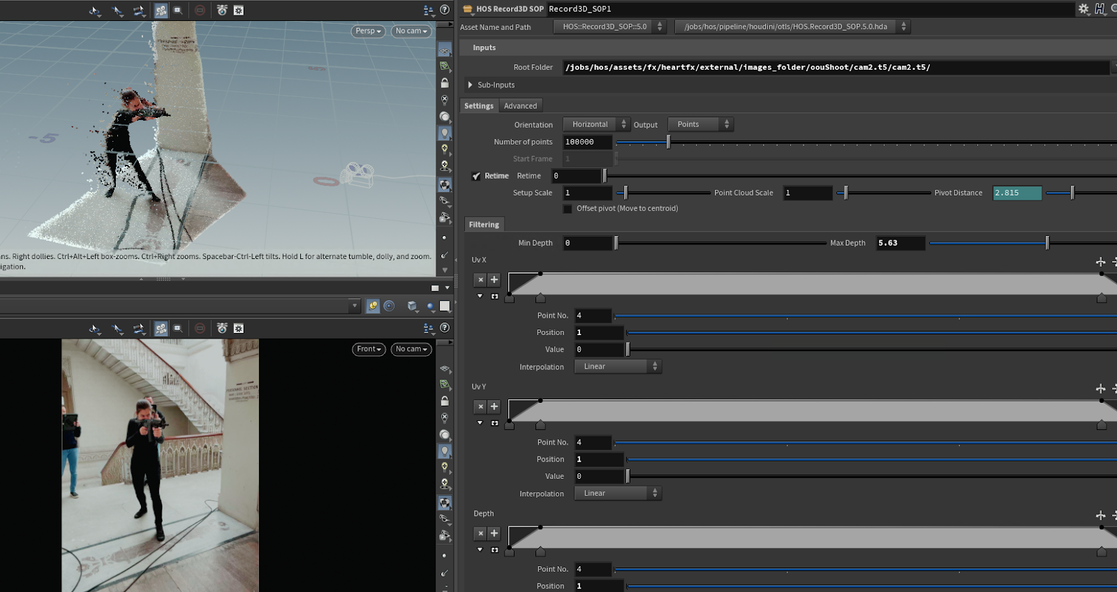
Assuming we have some animated geo, the first thing we need to do is to generate a retime curve. 

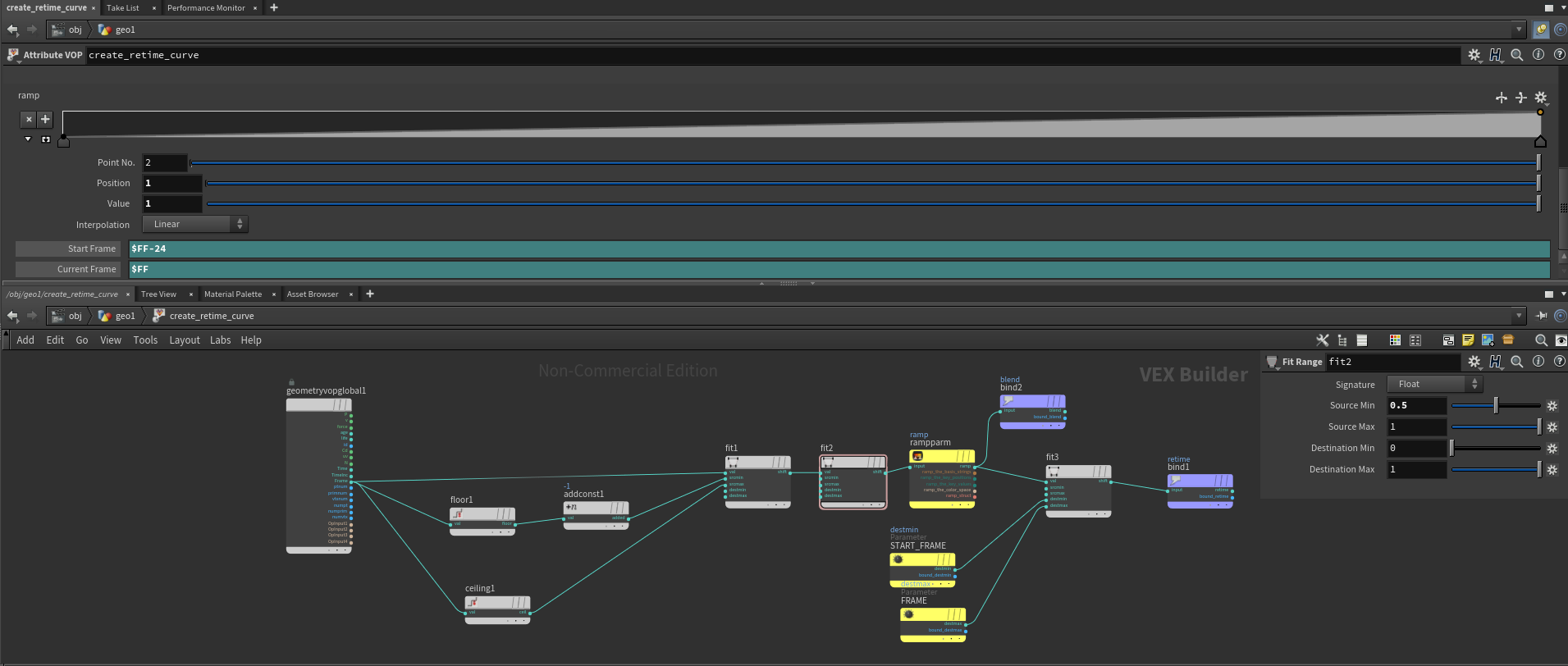
Click the image to see full screen, and let’s take it step by step. I chose to set this up in a vop network, but if you prefer vex I’ll add the code below. I'm running the vop/wrangle node in detail mode as it doesn't strictly speaking has anything to do with the geometry itself, it can be calculated wherever you see fit.


float f = fit(fit(@Frame,floor(@Frame)-1,ceil(@Frame),0,1),0.5,1,0,1);
float rmp = chramp("Ramp",f);
@blend = rmp;
@retime = fit(rmp,0,1,ch("Start_Frame"),ch("Current_Frame"));

Knowing that the global value Frame is a value with decimals we can use the floor and ceiling function and some fit-ranges and a ramp to get a 0-1 value in between each whole frame. I’m outputting that value as an attribute, in my case named blend, as it might prove useful later. For the “retime curve” I’m doing one last fit-range, where I map that blend value to a “start frame” and the current frame. The start frame is essentially how far backwards in time I want my interpolation to go.


Ok, we’ve covered the theory twice now, so let’s frame this beautiful box and flipbook it in all three dimensions. Beautiful, but pretty underwhelming.


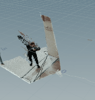
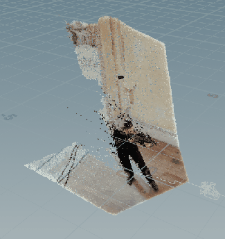
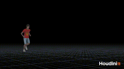
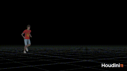
Let’s change our input to something more complex. I fetched an animation clip from Mixamo, but pretty much anything should work as long as you have something that can interpolate cleanly between frames (consistent point count/topology etc.).

Default/normal(/boring?) motion blur Var A - Looking ~10ish frames backwards
Var B - Looking ~20ish frames backwards Var C - Combining two different retime curves and blending between them using a noise

Alright, now we’re getting somewhere! By playing with the start frame values and blending two retimes with noise we almost get a smoke-like quality to the motion blur. And we can keep adding more complexity to it if we wish. And whilst some of you might not find it visually amazing we should consider the following;

  • It’s procedural
  • It only evaluates/cooks at render time*
  • It can be applied on top of any cache where we have consistent topology; like a character with simmed cloth and hair
  • It’s versatile; it can be combined with any number of other FX and techniques to add visual fidelity
  • Most importantly, we (hopefully) have a deeper understanding of how we can manipulate what happens in between frames and how motion blur works
* Whilst I would say it’s computationally speaking a relatively efficient technique, it still requires you to work on unpacked geometry, and re-exporting things back out to disk isn’t really feasible either considering the nature of the effect and its existence on sub frames…

And as promised, the project this technique was used extensively on recently was Madame Web.

Thanks for reading.  


3 days ago

Heart Of Stone - VFX Case Study - Part 2: Data Visualization

As covered briefly in part one, a big part of “The Heart” was its almost infinite powers to gather data from any thinkable source; phones, cameras, microphones, bank records, medical records etc.. There was a desire to showcase these abilities in the holograms, through displaying huge quantities of data, and showing how The Heart would filter through it all when coming up with it’s answers.

Houdini, as I covered in part one, is well suited for working with data of different types, so this article will be about how you can use Houdini to essentially visualize data. And as a disclaimer; this isn’t really a groundbreaking use case of Houdini, and there are likely to be better/smarter ways of doing things than what I’m outlining here.

Unlike part one, this article won’t be specific to anything we did for Heart of Stone, but more of an holistic insight into various methodologies we explored and used on that project in the realms of data visualisation.

Getting the data in to Houdini

Two views of a box

Houdini and its ability to visualize and manipulate data, as unsexy as it might sound, is a fundamental part of the software. With dedicated parts of the UI essentially allowing you to look at 3D models as numbers in a spreadsheet rather than as polygons in a viewport.

One thing you might find when you go looking for data sources is that certain formats and file types occur more often than others.”csv” files are a good example. CSV is actually so common that Houdini comes with a pre-made node for being able to read them; Table Import. A pretty simple, but really useful node for anyone who wants to dabble into visualizing data in Houdini. Let’s give it some data and see if we can come up with something to visualize.

A quick google search led me to a data-set showing crimes in Los Angeles , and it included fields like time/date and locations as lat/lon coordinates, which is something I know the Table Import SOP can do cool things with. So I’m going to use that data set as an example. Regardless of what data-set you intend to bring into Houdini, it’s useful to take a look at it in something like Excel or Google Sheets first, so that you can have more of an educated guess as to what data might be interesting to you.


This screenshot shows the basics of how the node works; you add however many attributes you want, and by setting the “Column Number” parameter you choose which column from the csv/spreadsheet it should use, and for each row in the csv I’ll get a point with the attributes stored on it. In this example I’m only reading a few attributes, but obviously nothing is stopping us to add more later if we want to. The Translator parameter offers a couple of really handy tools for dealing with certain data types like geo locations and dates, and I’m using that Translator to convert the lat/long data to a spherical mapping. The “Date to Seconds” option might not be intuitively useful, but a thing you realize when you start looking at time data and sorting things chronologically is that the various formattings of dates and times (YYYY/MM/DD, DD/MM/YYY,DDMMYYYY and so on..)  make it very annoying to work with. By converting date and/or times into a single value of seconds it becomes trivial to do basic arithmetic and all sorts of things and you’ll just be happier. Trust me.


Having said that, in this particular case I couldn’t get the built in Translator to do the work for me when I gave it the date, and secondary this particular dataset had the time as a separate column, so I opted for just storing the two attributes; date and time as strings, knowing that I would need to further massage that data.

Prepping the data

So my thinking is that I need to find a way of converting time to seconds and date to seconds and then add those value together so I can sort my points/crimes chronologically. The time data looks like this and is essentially an exercise of converting from one number system to another, which I think should be quite straight forward, so let’s start with the date data:

“01/26/2020 12:00:00 AM”

So we’ve got a MM/DD/YYYY format, and I’ve noticed that 12:00:00 AM is constant, which makes sense since time is stored as a separate value.So I’ll ignore the time component of the date attribute.

On the top of my head I don’t know how to convert a date into seconds, so I’ll ask ChatGPT. After a couple of prompts and some minor tweaks I’m left with the following code that will run in a Python SOP

import hou
from datetime import datetime

# Function to convert date string to seconds
def date_to_seconds(date_str):
    # Parse the date string into a datetime object
    date_obj = datetime.strptime(date_str, "%m/%d/%Y")

    # Convert the datetime object into a Unix timestamp
    timestamp = date_obj.timestamp()

    return int(timestamp)

# Get the input geometry
geo = hou.pwd().geometry()

# Get the point attribute "date" and create a new attribute "date_seconds"
date_attr = geo.findPointAttrib("date")
if date_attr is not None:
    date_seconds_attr = geo.addAttrib(hou.attribType.Point, "date_seconds", 0)

    # Loop over points
    for point in geo.points():
        date_str = point.attribValue(date_attr)
        seconds = date_to_seconds(date_str.split(" ")[0])
        point.setAttribValue(date_seconds_attr, seconds)
else:
    raise ValueError("Attribute 'date' not found on points.")


That code runs without throwing any errors, and the data in the Geometry Spreadsheet confirms that it’s working. Thanks ChatGPT!

A couple of more queries and I’ve gotten it to take care of my time attribute too. The final 99.9% ChatGPT generated code looks like this:

import hou
from datetime import datetime

# Function to convert date string to seconds
def date_to_seconds(date_str):
    # Parse the date string into a datetime object
    date_obj = datetime.strptime(date_str, "%m/%d/%Y")

    # Convert the datetime object into a Unix timestamp
    timestamp = date_obj.timestamp()

    return int(timestamp)

# Function to convert time string to seconds
def time_to_seconds(time_str):
    # Parse the time string into hours and minutes
    hours = int(time_str[:2])
    minutes = int(time_str[2:])

    # Convert hours and minutes to seconds
    seconds = hours * 3600 + minutes * 60

    return seconds

# Get the input geometry
geo = hou.pwd().geometry()

# Get the point attribute "date" and create a new attribute "date_seconds"
date_attr = geo.findPointAttrib("date")
if date_attr is not None:
    date_seconds_attr = geo.addAttrib(hou.attribType.Point, "date_seconds", 0)

    # Loop over points
    for point in geo.points():
        date_str = point.attribValue(date_attr)
        seconds = date_to_seconds(date_str.split(" ")[0])
        point.setAttribValue(date_seconds_attr, seconds)
else:
    raise ValueError("Attribute 'date' not found on points.")

# Get the point attribute "time" and create a new attribute "time_seconds"
time_attr = geo.findPointAttrib("time")
if time_attr is not None:
    time_seconds_attr = geo.addAttrib(hou.attribType.Point, "time_seconds", 0)

    # Loop over points
    for point in geo.points():
        time_str = point.attribValue(time_attr)
        seconds = time_to_seconds(time_str)
        point.setAttribValue(time_seconds_attr, seconds)
else:
    raise ValueError("Attribute 'time' not found on points.")


With just a few basic attributes prepared we can do a number of interesting visualizations already.

In this example I’m deleting points based on a normalized time to essentially give a timeline view of the data. The “heatmap” is created by a simple point cloud look up counting how many points/crimes there were in each part. It’s easy to imagine how we can use these relatively simple building blocks to drive more complex systems in Houdini. Maybe the points could drive a particle sim? We could combine it with the Labs OSM nodes so that we can see the crimes/points in the context of a city with streets and buildings? OSM also has lat/lon coordinates btw, which is super convenient if you want two or more data sets to line up.


Also, we have barely scraped the surface of the initial data-set; we could add attributes that describe the type of crime, the age of the victim and  a number of other interesting pieces of data; which in turn will lead to more things we could visualize

Here's another couple of examples showing some of the things we can do with our data
Points>Triangulate2d>Diplaces>Slize "Topographic" map of crime in Los Angeles


In the interest of keeping the article at a sensible length I’ll stop here, but hopefully it's given you a taster for how we can work with external data in Houdini and create cool visuals with them. My next article will be focusing on a different project entirely, but I intend to revisit the topic of data visualization in Houdini again in the future so stay tuned.

For further reading/watching on the subject I recommend the following

Entagma

Labs OSM Import


1 week ago

Heart Of Stone - VFX Case Study - Part 1: Lo-Fi Holograms

Breakdown of some of the techniques developed for the hologram FX by One Of Us and myself for Heart Of Stone

In this post and maybe the next couple, I'll elaborate on some of the visual effects the One Of Us team and myself developed for "The Heart" in the Netflix film Heart of Stone.


The Brief

“The Heart” is the name of the all-knowing all-seeing supercomputer the protagonists, The Charter, uses to plan and coordinate their spy/world-police activities. The Heart appears visually in a few different ways; as a hologram, on screens and as “augmented reality” overlays in first person view shots of agents that are wearing a fancy spy-gadget contact lens.  

From the outset we knew a few things about The Heart in it’s hologram form was meant to function in terms of the physical space it occupied on the set(s) and how the characters interacted with it. In terms of its aesthetics, and I’m possibly paraphrasing here, it was described as “a 80’s VHS version of a holographic display”, meaning imperfections, glitches and low visual fidelity were intrinsic to its design.
 

Another key part to The Heart, and the story, was to convey its abilities to process and analyse huge amounts of data, and although it’s not explicitly said in the film itself, The Heart could be seen as an analogy of AI.

In the next few sections I’ll break down some of the development that went into visualising The Heart.

Lo-Fi Holograms

One of the key abilities the hologram version of The Heart needed was to display three dimensional “footage”. This included 3D representations of environments as well as people and performances.

One approach would have been to go down a traditional CG work-flow of building assets, characters etc. and animating them, and as a last step apply some sort of holographic look through a mix of FX, look-dev and comp treatments. Which is what we did in many cases on this film.
 

More interesting though, in my opinion, we developed some less ordinary workflows to give The Heart life.

One of the design philosophies behind the all-seeing nature of The Heart was that it could access any device (cellphones, cctv cameras, computers etc.) in the world and access data from it, and from that draw images. So we looked at ways of being able to capture environments and performances and using that as a base for the holograms. This process was very much led by the production side VFX Supervisor, Mark Breakspear, and his team, and in pre-production we did a test shoot using the later generation iPad Pros, that has a built in LIDAR sensor.
 

To capture LIDAR footage on the iPads we used an app called Record3D (https://record3d.app/), which allows you to capture point cloud videos in a very quick and easy way.

Once we had the footage the next step was to find a way of bringing the footage into our pipeline so that we could work with it. Houdini is our 3D software of choice, and it lends itself very well to those kinds of tasks where you need to manipulate data. So the first tool I built was essentially a Record3D importer for Houdini.


As you can see, the footage has a lot of built-in imperfections and glitches, but for our case that was desired, and if anything we actually ended up adding more glitches and FX on top of the “raw” footage.

One technique we used a lot across our holograms to give them a low fidelity look was to animate a the input of a rint function to get a pixel/voxel-ised look. I always thought of that effect as something that resembles what happens visually in a typical IPR render

Here’s an example of what it looks like in its most basic form in a VEX oneliner:

@P = rint(@P * ch("Freq")) / ch("Freq");


From there it’s easy to experiment with various ways of adding break-up and complexity to it. Here’s an example of that

And that concludes the first part of what might be a series of blog posts

1 month ago